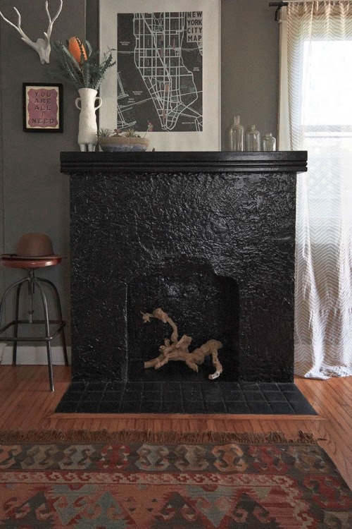
There are lots of ideas on how to create perfect vignettes and displays but my favorites are by COLOR or THEME and by using the TRIANGLE method. By color or theme is pretty self-explanatory. You'll see some examples of this in the following photos.
 |
| A nice example of an asymmetrical triangle with the tip of the plant being the tip of the triangle. |
 |
| Imagine a loose triangle here even though the top objects are flat. |


.jpg)


.jpg)


.jpg)


.jpg)


.jpg)


