
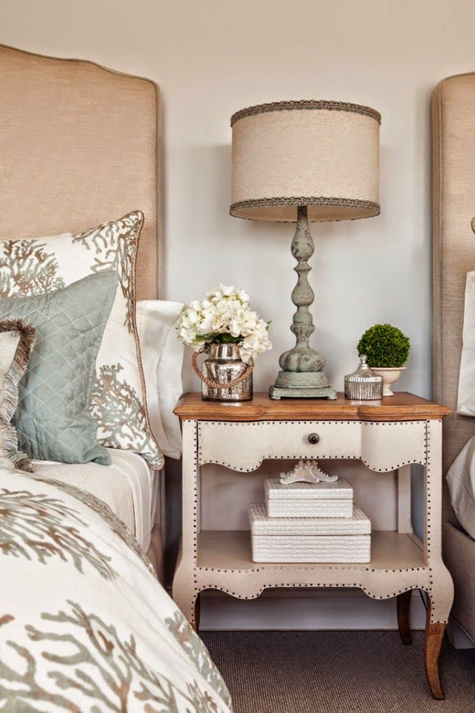
In other words, use many different shades of your neutral color and a variety of textures in your finishes, furnishings and accessories. Using all of one shade would be boring. But as the following examples testify, using a variety is the spice of your decor!
 |
 |


 |
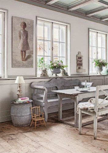
| All photos are from Pinterest unless specified on or below photo. |


 |
| Debbie Dusenberry fabulousness! |


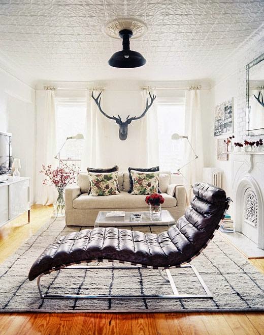 |
| Lonny |


 |
| Pottery Barn |


 |
| Lonny |

 |
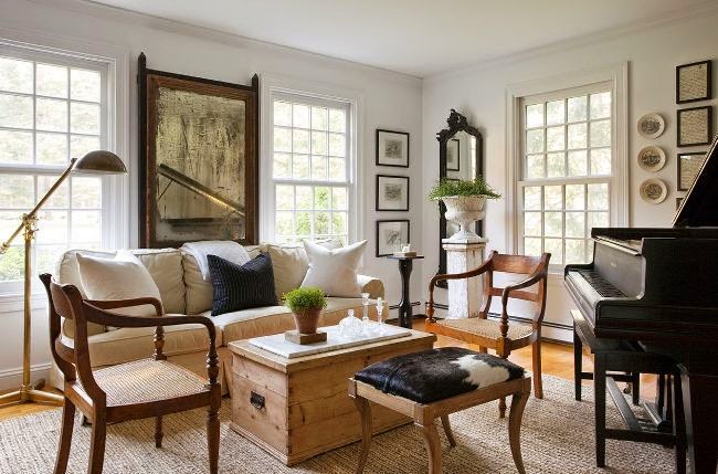
| Nate Berkus |