ART PIC OF THE DAY - Click it for info...

ART PIC OF THE DAY - Click it for info...

Monday, April 13, 2015

NEUTRAL TERRITORY - Part 1

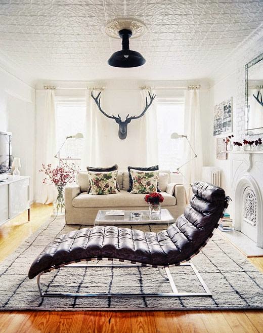
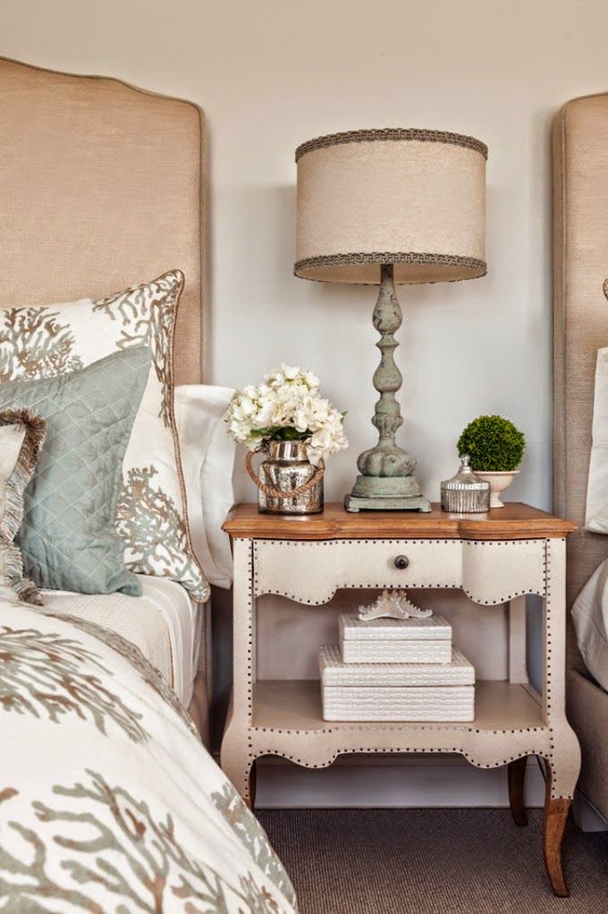
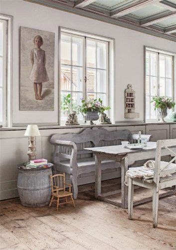
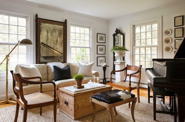
NEUTRALS don't have to be boring and beige needn't be bland! Following you'll find some lovely,  stunning and/or awesome rooms where neutral is done right in many different designs and genres. There are some keys to getting it right, though. Some folks are timid with the use of color in their homes, others love the peacefulness of neutrals, still others like their artwork or furnishings to take center stage. Whatever the reasons, think of these colors: tan, buff, cream, khaki, gray, greige, taupe, white, ivory, chocolate and even black. This doesn't sound too boring, does it? That's without even getting into to all the cool names the color consultants come up with to call these and all their variations: camel, fawn, oatmeal, buff, cafe au lait, biscuit, coffee, tawny, mohogany. Sound lovely, don't they? And they can be! The main key is the variety, the layering. Contrast is the name of the game. I personally love using black or dark woods as a contrast to light neutrals.

In other words, use many different shades of your neutral color and a variety of textures in your finishes, furnishings and accessories. Using all of one shade would be boring. But as the following examples testify, using a variety is the spice of your decor!


All photos are from Pinterest unless specified on or below photo.


Debbie Dusenberry fabulousness!


Lonny


Pottery Barn


Lonny

Nate Berkus